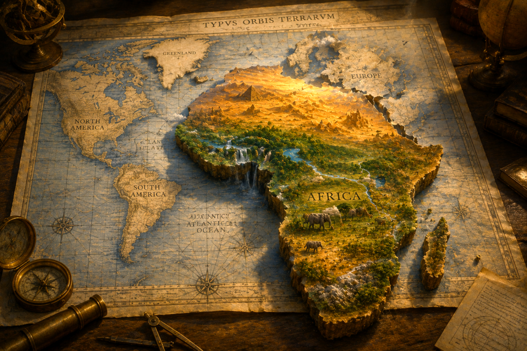

Africa looks smaller on maps because most world maps use projections, especially the Mercator projection, that stretch areas near the poles and compress land near the equator. Since Africa straddles the equator, its true vastness is visually reduced, shaping how we intuitively perceive its scale and significance. (Africa is much bigger than most maps show, and a new campaign wants that fixed)
- Africa’s map-size is compressed by common projections that distort areas near the equator.
- Eurocentric navigation and empire helped turn one distorted map style into the global norm.
- Repeated exposure to these maps quietly shapes our intuition about scale and importance.
Intuitive Contrast: The Hidden Vastness Of Africa
On many classroom wall maps, Africa seems comparable in size to Europe, perhaps a little larger than Greenland, somewhere in the visual middle of things. Africa Is Way Bigger Than You Think According to Scientificamerican, this analysis holds true.
Yet Africa is immense. It could contain the United States, China, India, much of Western Europe, and still have room. It holds over 50 countries, diverse climates from Sahara to rainforest, and an extraordinary range of cultures and languages.
This striking gap between what the eye learns from the map and what the Earth actually holds is the doorway into understanding why Africa looks smaller on maps—and what that distortion reveals about cartography, power, and perception.
The Geometry Of Distortion
Why Flat Maps Must Distort The World
The Earth is (approximately) a sphere. A flat map is a rectangle. Transforming a curved surface onto a flat one without tearing or stretching is mathematically impossible.
Cartographers choose map projections: systematic ways to translate the globe onto a plane. Each projection preserves some properties—shape, area, distance, direction—while sacrificing others.
- Equal-area projections keep relative sizes accurate but can distort shapes.
- Conformal projections keep local shapes and angles accurate but can distort area dramatically.
Most people encounter the second type first.
The Mercator Projection And The Equator
The most influential conformal projection is the Mercator projection, introduced in the 16th century. It preserves angles and compass directions, making straight lines on the map correspond (approximately) to constant compass bearings at sea.
To achieve this, Mercator stretches the vertical scale increasingly toward the poles. Landmasses near the equator are relatively compressed, while those closer to the poles are enlarged.
Africa, largely straddling the equator, sits in the low-distortion zone for shape—but its area is visually suppressed compared with high-latitude regions.
By contrast:
- Greenland, placed far to the north, becomes visually inflated.
- Europe and North America, also in higher latitudes, appear larger and more central than their true share of Earth’s surface.
The geometry is not malicious in itself; it is a consequence of what the projection is designed to prioritize. Yet once it becomes the default lens, geometry quietly becomes ideology.
From Navigation Tool To Global Norm
A Map Built For Sailors
The Mercator projection was crafted for a very specific purpose: European ocean navigation. Sailors needed a way to plot courses using constant compass bearings. For this, preserving angles trumped preserving area.
In that original context, the distortion near the poles was a known trade-off. The map was a tool, not a universal picture of the world.
Empire, Printing, And Standardization
Over time, as European powers expanded their reach, the tools of navigation shaped the tools of education.
- European empires needed consistent maps for trade, conquest, and administration.
- Print technology and later mass schooling spread a relatively small set of map styles globally.
- The Mercator or Mercator-like projections increasingly appeared not just in ship cabins, but in classrooms, atlases, and boardrooms.
What began as a specialized nautical instrument gradually became the standard world map for many institutions. The priorities of seafaring and empire—routes, coasts, and angles—became the visual grammar through which generations would imagine the planet.
In this migration from deck to desk, something subtle happened: a projection optimized for one task began to stand in for reality itself.
Africa In The Cartographic Imagination
Visual Minimization Of A Continent
Within this dominant frame, Africa is structurally disadvantaged.
- It lies near the equator, where the Mercator projection compresses area.
- Its expanse is visually overshadowed by exaggerated regions to the north.
This means that, on a common wall map:
- Europe appears closer in size to Africa than it truly is.
- Greenland may look similar to or larger than Africa, despite being vastly smaller in reality.
The result is not only a geometric distortion but a symbolic shrinking of the African continent in the global imagination.
Symbolic And Cultural Implications
Visual scale carries more than numbers; it carries meaning. We intuitively associate size with importance, centrality, and power.
When a continent with profound human, cultural, and ecological diversity is routinely shown as relatively small and peripheral, several subtle messages can arise:
- That Africa is a “background” rather than a central stage of human history.
- That its diversity and complexity are somehow less than those of visibly larger regions.
- That the global story radiates from the North outward.
These messages may never be stated, yet the image repeats until it feels natural. This is why cartographic choices matter: they do not only describe the world; they help construct our shared sense of what matters in it.
Table: Myths And Realities About Africa’s Size On Maps
| Aspect | Common Intuitive Myth From Maps | Geographical Reality |
|---|---|---|
| Africa vs. Europe | Africa is only slightly bigger than Europe | Africa is roughly three times larger than Europe in land area |
| Africa vs. Greenland | Greenland is similar in size, maybe even larger | Africa is many times larger; Greenland is a fraction of its size |
| Africa’s Global Role | Visually secondary, often shown below or beneath the “center” | Central to human history, ecology, and cultural diversity |
| Map Distortion Significance | A minor technical detail of map-making | A structural influence on perception, power, and symbolic importance |
This contrast between myth and reality is not a trivial optical illusion; it is a quiet educator.
Noesis, Intuition, And The Maps In Our Minds
How Repetition Shapes Intuitive Knowledge
Noesis—insightful, direct apprehension of meaning—depends partly on the images we repeatedly absorb. Our intuition about the world’s layout is not neutral; it is trained.
Most of us first encounter the world through a classroom map long before we travel. That map becomes a mental template:
- Continents appear with certain sizes and positions.
- The “top” of the world is usually north; the “center” is often Europe or the North Atlantic.
- Africa occupies the lower middle, visually large but not vast, present but not dominant.
Over years, this image fuses with our sense of reality. We may learn facts that contradict it—Africa is huge, most people live in the Global South—but the felt shape of the world still follows the map.
From Passive Seeing To Conscious Curiosity
To practice noesis here is to notice: What have my maps been teaching me, quietly, about value and scale?
Conscious curiosity invites us to:
- Question why certain regions appear central or enlarged.
- Reflect on how visual centrality can translate into perceived cultural centrality.
- Recognize that tools of representation are never neutral; they participate in meaning-making.
This is not about guilt over old maps; it is about awakening a more holistic perspective on how knowledge and power intertwine.
Toward A More Holistic Worldview
Alternative Projections, Alternative Intuitions
There is no perfect flat map, but there are projections that treat area more fairly and invite a rebalanced intuition.
Some examples often discussed in contemporary cartography:
- Equal-area projections (such as several modern designs) keep land areas in proper proportion, even if shapes look unfamiliar.
- South-up maps reverse the usual orientation, reminding us that “north on top” is a convention, not a law of nature.
- Centered-on-Africa maps place the African continent at the visual core, reflecting its geographic and historical centrality.
Encountering these alternatives can feel disorienting at first. That disorientation is a productive moment: it reveals how strongly our sense of reality has fused with a particular projection.
Mental Reframing Practices
Beyond adopting new wall maps or digital views, we can also practice inner cartographic reframing:
- When you picture a world map, consciously enlarge Africa in your mind to something closer to its actual share of Earth’s land.
- Imagine multiple centers: let your mental globe rotate so that Africa, the Pacific, or the Southern Hemisphere sometimes occupy the middle.
- When reading history or current affairs, pair the story with a more accurate map view, aligning narrative significance with true spatial scale.
These small acts of imagination recalibrate intuition. They help align intellect—what we know about the world—with intuition—what we feel about it.
In the spirit of thenoetik, this is where cartography becomes contemplative practice.
Africa Beyond The Frame
Respecting Diversity And Magnitude
To see Africa more accurately on maps is also to respect its plurality.
This is not a single, monolithic space, but a continent of:
- Hundreds of languages and cultures.
- Varied histories of empire, resistance, creativity, and philosophical thought.
- Ecologies ranging from deserts to highland plateaus, savannas to dense forests.
Shrinking Africa visually can unconsciously encourage shrinking it conceptually—reducing it to a few dominant narratives. Restoring its scale encourages a richer, more attentive gaze.
Maps As Mirrors Of Power
Historically, those who held the instruments of mapping often held the instruments of power. The lines on the map could follow, or precede, lines of conquest and trade.
Recognizing this does not mean that every map is an intentional act of domination. It means that every map is also a cultural artifact, shaped by:
- Who needed it.
- What journeys they prioritized.
- Which relationships they wished to see clearly.
When we ask why Africa looks smaller on maps, we are also asking: whose journeys defined the default view of the world—and whose perspectives were left at the margins?
Closing Reflection: Seeing With Intellect And Intuition
The puzzle of why Africa looks smaller on maps opens into a larger invitation.
We learn that a technical choice in projection can echo through centuries of perception. That history, geometry, and power converge in something as ordinary as a classroom map. And that our inner maps—our intuitions—can be gently redrawn.
For thenoetik, this is the deeper practice: to unite intellect and intuition, geography and noesis, so that our understanding of the planet is not only accurate, but also consciously inclusive.
When we look at a map now, we can pause, reflect, and ask: What is this image teaching me about the world—and what might it be leaving small, when in truth it is vast?
In that question, conscious curiosity awakens. And the world, including Africa, regains its true magnitude in our shared imagination.
Frequently Asked Questions
Why does Africa look smaller on the Mercator projection compared to the poles?
The Mercator projection uses a mathematical formula that stretches objects farther from the equator to maintain straight lines for maritime navigation. Because Africa sits directly on the equator, it experiences the least amount of distortion, while landmasses like Greenland and Europe are artificially expanded, making Africa appear relatively small by comparison.
Which major countries can fit inside the actual landmass of Africa?
Africa’s true landmass spans roughly 11.7 million square miles, which is large enough to fit the entire United States, China, India, Japan, and most of Western Europe simultaneously. Despite this immense scale, standard rectangular world maps often suggest these individual nations are comparable in size to the entire African continent.
Why did the Mercator map become the global standard for education?
Gerardus Mercator designed his map in 1569 specifically for marine navigation because it preserves constant bearings, allowing sailors to navigate easily across oceans. As European maritime powers dominated global trade and colonization, they exported this specific projection as the universal standard for classrooms and political offices, regardless of its geographic inaccuracies.
What is the difference between the Mercator and Gall-Peters projections?
The Mercator projection prioritizes shape and direction, which distorts the relative size of landmasses increasingly as they move toward the poles. In contrast, the Gall-Peters projection is an equal-area map, meaning it accurately represents the relative size of continents, finally showing Africa’s true vastness compared to Europe and North America.
How does map distortion impact perceptions of Africa’s global importance?
Map distortions can create a subconscious “size equals power” bias, where enlarged northern nations are perceived as more significant. By visually shrinking Africa, these maps can reinforce Eurocentric narratives that marginalize the continent’s economic and geopolitical importance, influencing how students and policymakers perceive the weight of African global contributions.