The evolution of color palettes is more than just a design trend; it reflects shifts in culture, technology, and artistic movements. From ancient civilizations to modern digital design, our understanding and use of color have transformed significantly. In this article, we will delve into how color palettes have changed throughout history, the impact of these changes on design practices, and the significance of color in conveying meaning and emotion.
Understanding Color Theory: A Brief Overview
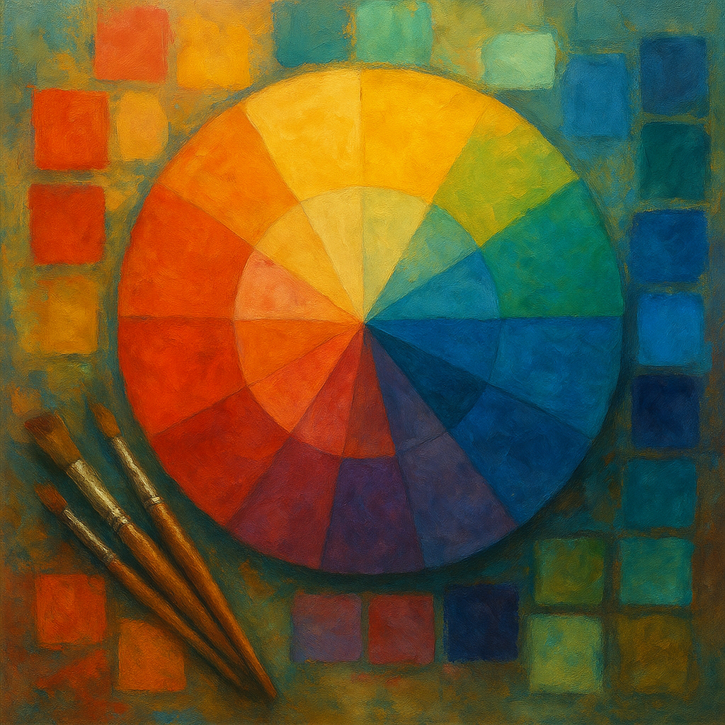
Color theory forms the foundation of the evolution of color palettes. At its core, it involves the science and art of using color effectively. This includes understanding how colors interact, the emotions they evoke, and their cultural meanings.
The Basics of Color Theory
1. Primary Colors: Red, blue, and yellow are the building blocks of all colors. These hues cannot be created by mixing other colors.
2. Secondary Colors: Combining primary colors yields secondary colors such as green, orange, and purple.
3. Tertiary Colors: These are created by mixing a primary color with a secondary color, like red-orange.
To explore this further, consider studying resources like Academic Research Portal which hosts a wide array of research on color theory and design practices.
The Historical Context of Color Palettes
The history of color theory showcases various phases in the evolution of color palettes. Let’s explore some key historical moments:
1. Ancient Civilizations
In ancient times, color was often associated with cultural significance and symbolism:
* Egyptians used vibrant colors in their art. Blue and green represented life and fertility.
* Romans valued color in decor and fashion, with purple often indicating royalty.
2. The Renaissance Era
During the Renaissance, artists began to explore color in a greater depth:
* The introduction of oil paints allowed for richer, more vibrant palettes.
* Artists like Leonardo da Vinci experimented with color mixing to create realistic skin tones.
3. The Industrial Revolution
As industrialization progressed, color became more accessible:
* Mass production techniques resulted in synthetic dyes, leading to more diverse color palettes in fashion and art.
* This period saw the rise of color palettes that reflected the new technological advancements.
This evolution in color palettes through history reflects broader societal changes. As we understand the impact of color on art, it’s essential to recognize that color can influence perception and behavior.
The Significance of Color in Design
Understanding the significance of color in design is crucial for effective visual communication. Color palettes can evoke emotional responses, convey brand identity, and enhance user experience. Here are a few points to consider:
* Color Psychology: Different colors evoke different feelings. For instance, blue can induce calmness, while red can create a sense of urgency. Studies show that colors can influence decision-making processes in consumers (source: Government Research Database).
* Cultural Color Meanings: Colors carry different meanings across cultures. For example, white symbolizes purity in some cultures but is associated with mourning in others.
Evolution of Color Palettes in Modern Design
As we navigate the contemporary landscape, the palette design evolution continues:
* Digital Design: Modern palettes often rely on digital tools, allowing designers to experiment freely. Tools like Adobe Color make creating and sharing palettes effortless.
* Sustainable Design Movements: These movements have sparked interest in earthy, muted color palettes that reflect a more organic approach to design.
Key Contemporary Color Palette Trends
1. Minimalism: Focuses on simple, understated palettes that convey clarity and elegance.
2. Retro Aesthetics: Nostalgia-driven palettes featuring pastels or neon hues reminiscent of past decades.
3. Nature-Inspired Colors: Colors that draw from natural landscapes, emphasizing sustainability.
These trends showcase the impact of societal influences and technology on color choices.
How to Create Effective Color Palettes
Creating concepts that resonate requires an understanding of how to use colors effectively. Here are steps to create a cohesive color palette:
1. Define Your Purpose: Understand the emotions you wish to evoke through your color choices.
2. Choose Primary Colors: Start with a few base colors that align with your project’s intent.
3. Use Tools: Leverage online resources and tools to visualize how colors work together, like Adobe Color.
4. Test and Iterate: Experiment with combinations to find the most effective palette.
Tools for Exploring Color Palettes
* Coolors.co: A color scheme generator that allows for quick customization.
* Color Hunt: A curated collection of beautiful color palettes.
Conclusion: The Enduring Legacy of Color Palettes
The evolution of color palettes reflects more than aesthetic preferences; it encapsulates cultural shifts and advancements in technology. As design continues to evolve, understanding color’s historical context can inform future trends and improve design effectiveness.
Whether you’re a designer or an enthusiast, embracing the insights from the past can enrich your understanding of color and its power in visual communication. If you’re ready to dive deeper into the world of color, get started by exploring these concepts further!